
ProducePic Mobile Application
Making the unfamiliar, familiar.


Solo Project: Product Designer
Scope: February - June 2020
What is ProducePic?
ProducePic is a mobile application designed to identify unknown fruits and vegetables from around the world. The app gives users information on produce preparation, nutrition and location. Armed with this information users are more confident in purchasing, cooking and exploring new types of produce.
The Challenge
This app was designed to take the fear and apprehension out of purchasing something unfamiliar. It became clear in the early stages of research that people were naturally curious, but unwilling to purchase something they didn’t know how to cook or even how to cut. To satisfy that curiosity ProducePic helps identifies the unknown for travelers, provides seasonal/nutrition information for health enthusiasts, supplies a source of inspiration for chefs and vegetarians. The challenge of this application was to give people the best information they needed for them to feel comfortable cooking or purchasing something new.
High-level goals
1. Create an app that allows users to identify unknown produce through camera identification
2. Give users the most important information on produce to make a successful purchase
3. Allow users to find local produce through an interactive map
4. Create a user library so users can save produce and recipes directly in the app
The Process

DISCOVERY
Secondary Research
Who is this for? Is this advantageous?

I knew personally from my travels that this application was something I had wanted while abroad. I sometimes struggled to purchase food at local markets due to the language barrier. I couldn’t identify exotic produce and my lack of knowledge led to me staying away until I could find someone who spoke English. This was my dilemma, but was this something that more people could benefit from? After some research I discovered that I was not alone. This was not only applicable to my situation, but people at home also had a need for it.
Top 3 takeaways
1) Plant-based diets are on the rise globally and across America.
2) A recent Nielsen global survey found that 23% of consumers want more plant-based proteins on the shelves.
3) More people are traveling and are basing their travels around food experiences.
Hueristics Analysis


1) PlantSnap
1) Nature Mobile's Exoctic Fruit

3) PlantNet
I studied three different competitors and made my evaluation focused on three different principles from Jakob Nielsen's 10 general principles for interaction design:
#4 Consistency and Standards - Users should not have to wonder whether different words, situations, or actions mean the same thing.
#6 Recognition rather than Recall - Minimize the user's memory load by making objects, actions, and options visible. The user should not have to remember information from one part of the dialogue to another. Instructions for use of the system should be visible or easily retrievable whenever appropriate.
#8 Aesthetics and Minimalist Design - Dialogues should not contain information which is irrelevant or rarely needed. Every extra unit of information in a dialogue competes with the relevant units of information and diminishes their relative visibility.

PlantNet
Aesthetics and Minimalist Design
Rating: ⭐⭐2/5
Due to this app being socially focused, there are a ton of photos posted from people to sift through. At times, the amount is overwhelming.
The app also relies heavily on alphabetical order. With there being so many different plants in the world the lists feel very long. I think having more negative space in places would help the overload of information users experience. Also the text blends into the images on the first screen making the words difficult to read.


Nature Mobile
Aesthetics and Minimalist Design
Rating: ⭐1/5
This was the most disappointing aspect of the app. There is a ton of useful information, however it is so dense and visually unvaried that reading it feels laborious.
It is not pleasing to the eye and when there is an image added every five paragraphs it resembles a website from 1998.
After evaluating my competitors, it became clear that the biggest issue for them was steeped in their design overcrowding with so much information.
It was important to me that ProducePic stay streamline and not overwhelm it's users.
Online Screener

Screener Objective
Identify potential users and select information that users would find useful in and after produce identification.
Methodology
User screeners to access demographics for user interviews, to understand pain points and behavior around fruit identification, and usability testing
Participant Characteristics
-Grocery shops in foreign markets (either in the USA or abroad)
-Own a smartphone
-Cook for themselves
Recruiting Methods
-Ask if participants are interested in an interview on the survey
-Recruiting at local produce markets
-Social Media outreach to friends and family that currently live or have lived abroad
Interviews
Five interviews were conducted over the course of two weeks. Three interviews were done in person in San Francisco. Two were done over the phone with interviewees in Asia and each interview lasted approximately 30 min.
"...I'm curious, but I won't buy it because I don't know how to prepare it."
"I love local markets, but I struggle with the language barrier."
"I can't tell if some fruit is ripe or not and that on it's own will stop me from purchasing."
Defining the Discoveries

Comments grouped into 5 categories:
1) Shopping Confidence
2) Convenience
3) Cooking passions
4) Dietary needs
5) Quality Control
Most users
From the interviews it was clear that people had pain points in a couple of different areas...
User Personas
I created three distinct personas each steming from a main concept disovered through the affinity mapping. “Hilary Healthy” personifies the healthy eater in all of us, she care about nutrition. “Jeff The Chef” embodies the cook who wants to explore new flavors. “Ava the Avid Traveler” loves to travel on the cheap and is excited by anything new. These user outlines gave me a better understanding of user motivations, behaviors, goals and set the foundation for my design.

Hilary Healthy
The Framework
After analyzing the data from the interviews, competitor reviews, empathy maps and personas I was able to identify the major problems users faced. Next, it was time to come up with solutions to those problems within the app. I used the “How Might We…” format to layout those solutions.
How might we...
Make international produce shopping more accessible to non-native speakers?
-
By providing an in app translation
-
Displaying price comparisons for different countries. What is the average price for something in a region? ( many international markets don’t post price it’s done verbally, so many international customers never know what the true price of something is and are afraid of being ripped off)
-
Highlight traditional dishes that feature each piece of produce
-
Picture recognition for unknown produce, which will link to the following information
User Stories
I started to organize my solutions using user stories. I created a spread sheet to identify what the user wanted to do and what action could be taken to complete it. I highlighted the most crucial actions to be used as red routes in the application. I then formulated my MVP statement:

MVP Statement
This application will allow users to identify produce through photo identification. They will be able to find useful information on produce including: what it tastes like, ways to prepare it, ripeness cues, nutritional facts, photos of what the produce looks like inside and whether it is in season. Users will also be able to search locations on a map for regional produce information.

Site Map
The Design
Sketches
Sketches
Once the inforamtion archeiture was decided I began sketching my designs. My research deduced that iphones were the most popluar device so I drew up my initial sketches in iOS. I referred back to my user stories and flows as I created my screens. I had to make a few changes in structure to most effectively incorporate my users needs. I made sure each of my red routes flowed and colored any clickable buttons/picture green. I also highlighted scrolling screens in orange and extended information with added post-it notes. These sketches gave me a solid idea of how to structure each screen. Next it was time to refine my ideas and create more exact look with wireframes.


Wireframes


After completing all my wireframes I needed to visually understand how they would all work together by creating wireflows. I made a wireflow for each one of my red routes. This flow covers a user signing in, using the map to locate a particular piece of produce and allowing them to save it into their library.
After completing all my wireframes I needed to visually understand how they would all work together by creating wireflows. I made a wireflow for each one of my red routes. This flow covers a user signing in, using the map to locate a particular piece of produce and allowing them to save it into their library.
Mood Board

Style Guide Choices


I took the imagery and personality found in the mood board and started making UI decisions. I stayed on brand and chose ‘Pumpkin’ as the primary color. It’s a color thats pops and reminds people of produce (pumpkins, carrots, oranges..ect) and I wanted to stay away from green to stand out from competitors. I chose a rounded/soft feel so the app came off as approachable and modern. I created the logo to resemble a camera’s aperture within a pumpkin, bringing together the two key concepts of the application.
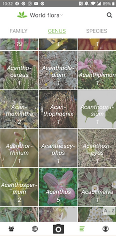
High Fidelity Screens


Usability Testing
Testing Objectives:
-To assess usability of the app’s primary tasks
- Understand how quickly can users adapt to the app (learning curve)
-Identify any problems users encounter while completing given tasks
-Allow participants to openly share their level of satisfaction with the app
-Evaluate accessibility
-Determine how clear or unclear any language/visuals are to the user
-Evaluate ease in navigation throughout the app
-Collect all findings and use data in further iterations
Testing Objectives:
Test Type
Five moderated usability tests will be conducted for this study. Four tests will be done remotely through Zoom and one will be in person. Each session should last between 15min-30min.
Testing Questions
“You find an unknown vegetable at the grocery store, use the app to identify it”
“You are currently in Hanoi, Vietnam and want to learn more about the local produce”
“You have an excess of bananas and want to find recipes that feature bananas”
Participants
Participants in the study will be found through my immediate network. I will use only people who fit the main user demographic and show interests in either cooking, travel, health/nutrition. I have already begun to set up testing sessions that will begin next week.
Analysis
Overall the testing sessions ran smoothly. Each participant said that the app was very clear to follow. All users were able to complete each task without any major difficulties. There were some minor issues, but nothing that needed a major overhaul of the design, just small tweaks. After making all the iterations from the first round of testing I conducted another five usability tests. The second round went even smoother and all the participants had a high satifcation rate.
Reflection/Next Steps
This design helped me uncover the users’ perspective and how user-centric design is critical for any application. The initial problem of giving buyers confidence through information was solved. If time permits, I would continue to work more on this product and add an additional idea that user expressed need it but I didn I didn’t have time to execute. Adding a “Price” section to the produce info page would allow users to compare the average price of produce between different countries. This tool would allow users to know how much they should be spending at the markets instead of having to guess.
Thank you for reading and if you would like to explore more there clickable protoype is below vvvvv